2016 Web Design Trends and Ideas


2016 Web Design Trends and Ideas
Every business owner would agree that they need to do everything they can to get people to buy their products or services. One way to do this is to showcase what you are offering through a fantastic website. With this in mind, we take a look at the most popular web design trends and what we can do to prettify your website and boost conversions significantly.
Hero Images
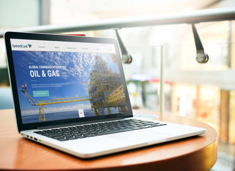
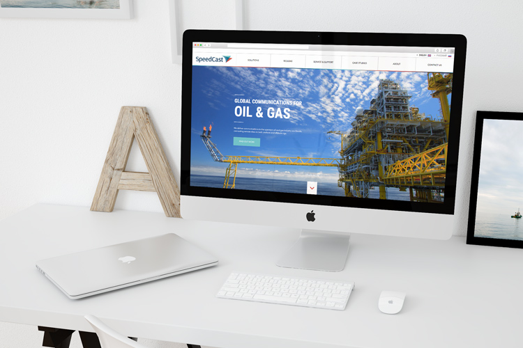
Probably one of the biggest trends that has been sweeping the UK’s Internet traffic, or the world really in terms of web design, is Hero images and/or Hero areas. So the question now is – what is a Hero image or a Hero area?
Hero images or areas are often described as a major graphic but this is not always the case.
It could be a video or text, but the text in a hero area usually uses some sort of graphics in the front end. The text should be huge and bold and it is presented right where the user gets onto the website. Hero areas are usually the first part of the website that the user will see.
The purpose of the Hero areas is to explain in a very generalised and yet specific enough way what the content and the main focus of the website is. Make the users want to know more about who you are and what you do.

Full-Width Images
Replacing small images with full-width images and something big and bold it is kind of interruption. That is why using full-width images make people stop and take notice which can lead to higher conversion. Images of people are recommended, because people prefer to see other people, happy, connected and showing common interest.
Ambient Videos
Using videos is a step further, swap out the full-width image with a large and smooth ambient video. Instead of being a distraction, the video should complement the accompanying text and even be used as a transition to the next section on the page.
Cinemagraphs
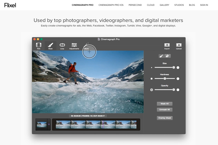
Have you ever heard of cinemagraphs? It is something new and a really cool alternative to the still photos. Cinemagraphs are a still image with one element of it that is moving. They essentially capture one specific moment and play the movement in a continuous loop. Big brands known to have used cinemagraphs in their marketing efforts include Netflix, IKEA and Coca Cola.
You can try to build one yourself using software like Cinemagraph Pro. Cinemagraphs look really nice and you should definitely try using them on your websites.

Proper Typography
The typography a really important element to your website and believe us, it can really make a difference to your conversions. Typography traditionally is how you present texts on your website. Nowadays it has become so much more than that. It has become a way to get people engaged in your website and also a way to draw in clients. It is not just about the font size, it is about what it says, it’s placement, style and simplicity but also at the same time the complexity and colours used.
Split-Screen Layouts
Using split screen layouts is another great option. Split-screen is when you have your homepage just split right into two areas side by side. When browsing the internet, studies suggest the user initially skims the page and your eyes zigzag across the page. By using a split-screen layout and placing important elements on each side, you can effectively split your visitors and funnel them to a product or overall category where they will most likely to convert.
Monochromatic Colours
Monochromatic colours are still colours, it is not just black and white, but it uses low light and highlights to give the impression of monochrome. A monochromatic colour scheme is a very good idea for your website used as a combination and accompanied by Call To Actions that contrast other page elements. If you have a website that is largely black and white, using monochromatic elements would helo your site stand out and keep your visitors for longer.
If you are considering a new website design or exploring ways to increase conversion, consider some of the latest design trends to ensure you are up to date and competing in your marketplace as effectively as possible. For more information about website design or to discuss any other trends not featured that you feel would be beneficial, contact us today.

